COMPANY
CI
JINYOUNG INDUSTRIAL CO., LTD. has introduced a new CI in September 2024, continuing the legacy of its previous CI meaning.
JINYOUNG INDUSTRIAL CO., LTD. Corporate Identity (CI)
The combination of the logotype and symbol mark representing JINYOUNG INDUSTRIAL CO., LTD.’s Corporate Identity embodies the core meaning of the company's mission, 進永 (JINYOUNG).
The bold and uniform typography of the English name “JINYOUNG” symbolizes the energy of JINYOUNG INDUSTRIAL CO., LTD. advancing powerfully forward. It also represents the sea and sky during sunrise and sunset, highlighting a sense of strength and stability.
The circular element at the top right symbolizes the eternal passage of time and a passionately blazing sun. Its alignment with the starting and ending points of the letter "G" reflects the infinite cycle of passion and composure. This arrangement simultaneously represents the foundational characteristics of forging, a key aspect of the company’s identity.
Designed with clear visibility and readability, even from a distance, the CI reinforces JINYOUNG INDUSTRIAL CO., LTD.’s global presence and the trust it has built in the international market.
01. Minimum Usage Guidelines
If the logo is used smaller than the minimum size, the primary logo without stripes should be used.
02. Korean, English, mixed
03. Color Guidelines
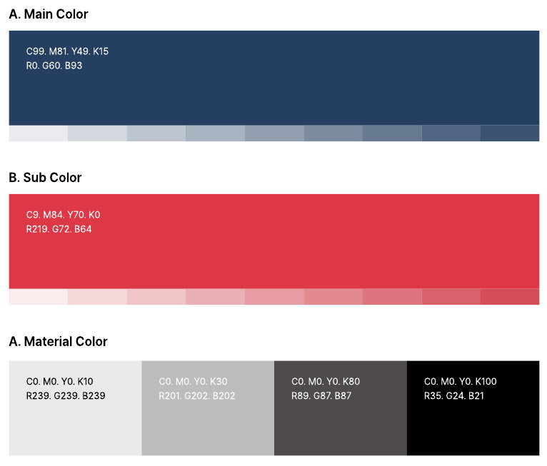
The proprietary colors are one of the key elements in forming JINYOUNG INDUSTRIAL CO., LTD.'s identity. These colors play an important role in conveying the company’s image when applied to the logotype and visual media. To ensure effective use of proprietary colors, factors such as printing methods, ink concentration, and paper quality must be considered to maintain standard colors. If there are any questions during production, it is essential to consult with the CI management department before proceeding with production.
04. Meaning of the Previous CI
The circular element at the top of the symbol mark represents the sun. It visualizes the image of JINYOUNG INDUSTRIAL standing tall against the background of the rising sun, symbolizing the company’s growth. The white letters "J.Y.I," illuminated by the sun’s rays, represent JINYOUNG INDUSTRIAL’s bright future and commitment to prosperity. The prominent size of the initials reflects the company’s strong presence and aspirations within its industry.